There has been a lot of talk recently about the importance of making sure your website is mobile compliant. There are several ways to make your website mobile friendly and many places on the web to learn how to do this (CLICK FOR LIST). We thought we would talk about one of the main reasons why you should make your website mobile ready and the SEO benefits.
Let’s first start with the two main reasons why to have a mobile friendly website:
- To ensure the visitor experience is perfect which ever device they are using.
- To deliver the websites content as quickly as possible to reduce the time the user has to wait as well as reducing the bandwidth used.
Today’s post we will be discussing reason number 2 and split it up into the following sections:
- Why it is important for the user to have a mobile friendly website
- Why it will help your website perform better, SEO wise
- How you can find out how fast your website is by using a free tool you probably already have installed on your PC already
Why is it important to have a mobile website for the user?
At the end of the day the most important thing about your website is that it is a great experience for your visitors. If visitors to your website don’t enjoy using it or couldn’t find what they were looking for then the chances are they won’t come back. Not what anyone wants, so when a visitor is using a mobile device the experience must also be good and one way to help this is make the pages load as quickly as possible.
The world is moving very quick and online surfers patients are very short, they simply will not wait long for a page to load, they will press back button and click onto another website.
A large percentage of mobile users will not be using a free WiFi connection but their own mobile usage tariff. By delivering large unnecessary pages to small screens it will use more of the visitors tariff. Although probably not on their mind when they are surfing but a consideration anyway.
How will a mobile website help my SEO?
Not everyone knows this but search engines like Google actually have more than one search engine. There is the standard desktop version (the original if you like), another one for images and there is also a version for mobile devices.
The idea is that when using a mobile device Google’s search result will present websites that are mobile friendly and therefore help the user find what they are looking optimised for their mobile device.
If Google can provide the user with the best mobile usage experience then users will continue to use Google in the future, so it is of great interest for Google to list mobile friendly websites.
TIP: If you are having trouble ranking better than your competition for a certain keyword then maybe ensure your website has a better user experience on mobile devices and out rank them there!
How to test the mobile speed of my website?
So you know Why it is important to have a mobile website and How it will help your websites SEO, next we will explain how you can find out how fast or slow your websites pages load using a FREE tool which is probably already installed on your PC.
The great thing about this tool is that it is really easy to use and you DON’T need any technical experience. The tool we will be using in this example is Google Chrome’s Inspect Element.
First off we will assume you have the Chrome browser already installed, if you haven’t you can download from here: GOOGLE CHROME
I always think it is easier to explain things with examples so I have chosen a website which I often shop on (I wish!) Rolls Royce Motor Cars. Incidentally if anyone is looking to buy a nice car at the moment the new Rolls Royce Wraith looks very nice.
Step by step instruction on how to test your website speed on a mobile device
Navigate to your website in Chrome, once loaded either right-click and select Inspect Element or press CTRL+SHIFT+I.
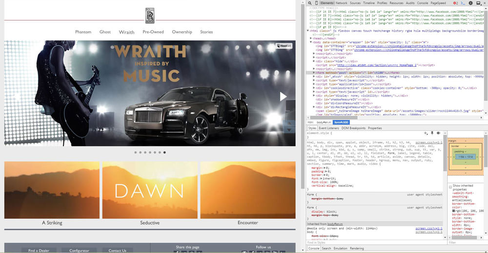
Google Chrome Inspect Element
As you can see in the above image the screen is split up into two sections, on the left is the normal website and on the right it shows a section of the HTML and CSS code for that page (the default display).
The top of the right panel has a menu with the Elements option selected as default, click on Network.
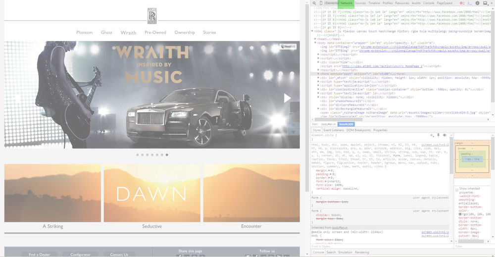
Inspect Element – Network Button
Just left of that button there is a little Mobile Phone icon button, click this button next.
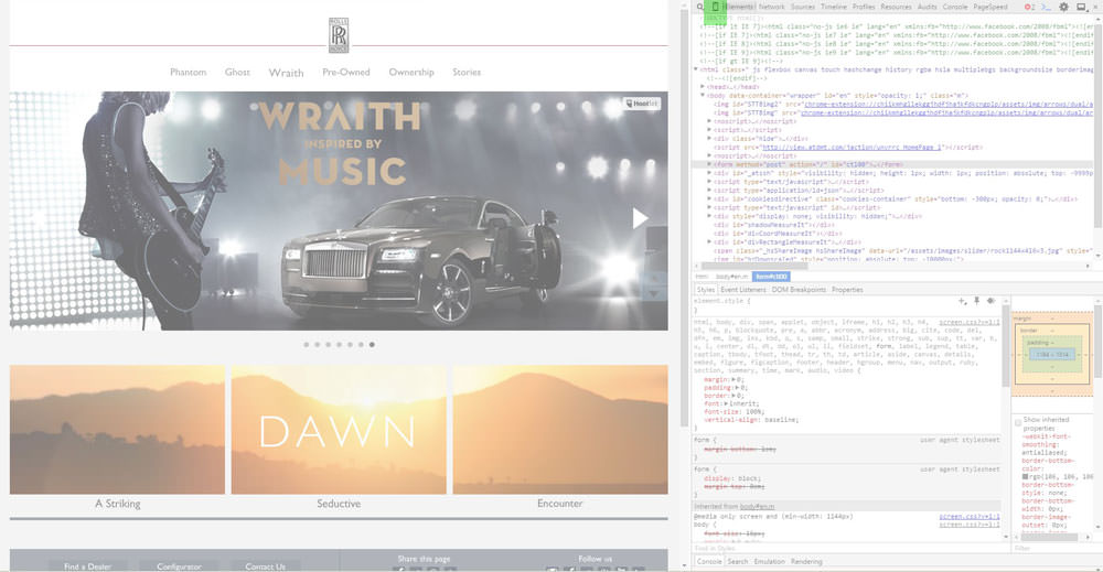
Inspect Element – Mobile Button
Now it gets exciting!
The left hand panel should have changed to a shape of a mobile device (it could be a tablet or phone as default), at the top of the left panel there are two drop-down menu options. The left hand menu is where you can choose the phone you wish this simulator to pretend it is. The menu on the right of it sets the situation the phone would be in.
So for this example we will select the popular Apple Iphone 6 whilst using a regular speed 3G network.
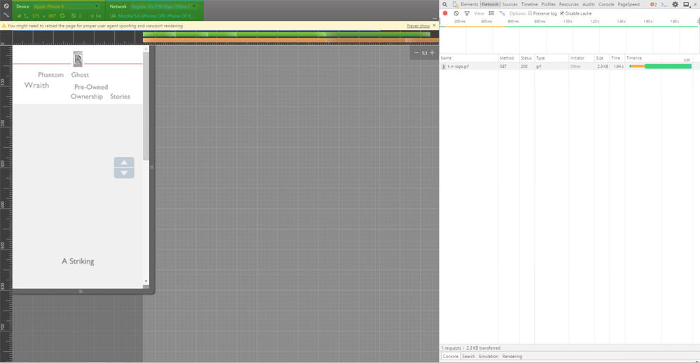
Inspect Element – Mobile Device Selector
So at this point we have set up the test, now we need to clear the log and start the recording. This is done on the right hand panel at the top just under the menu previously used.
The two buttons we are interested in are the Record and the Clear buttons.
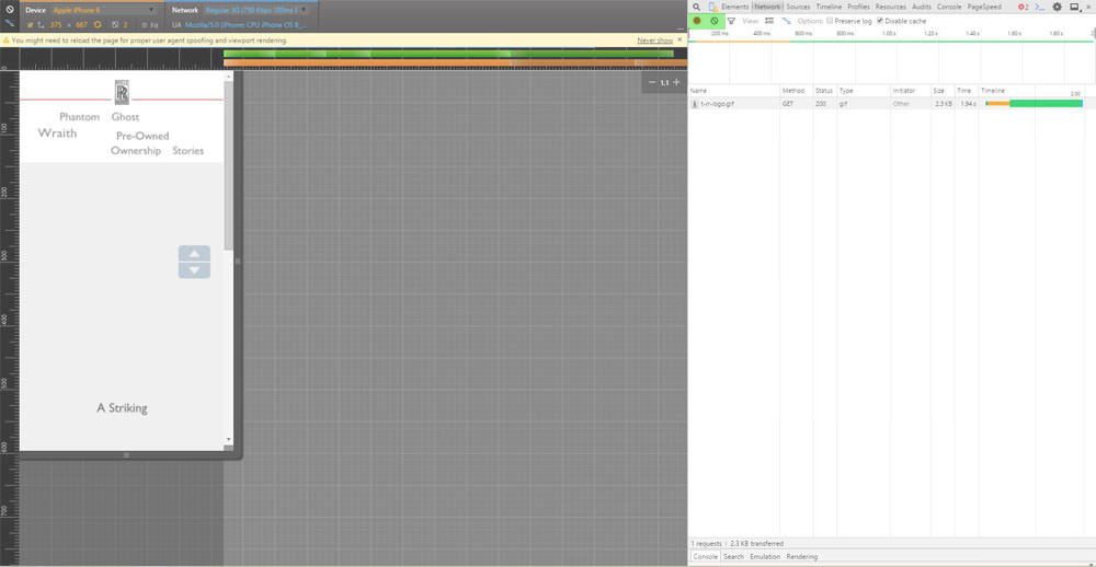
Inspect Element – Record and Clear Buttons
Press the record button so it is RED, which means it has started recording.
Just next to it click on the Clear button to clear the log.
It should now look something like this.
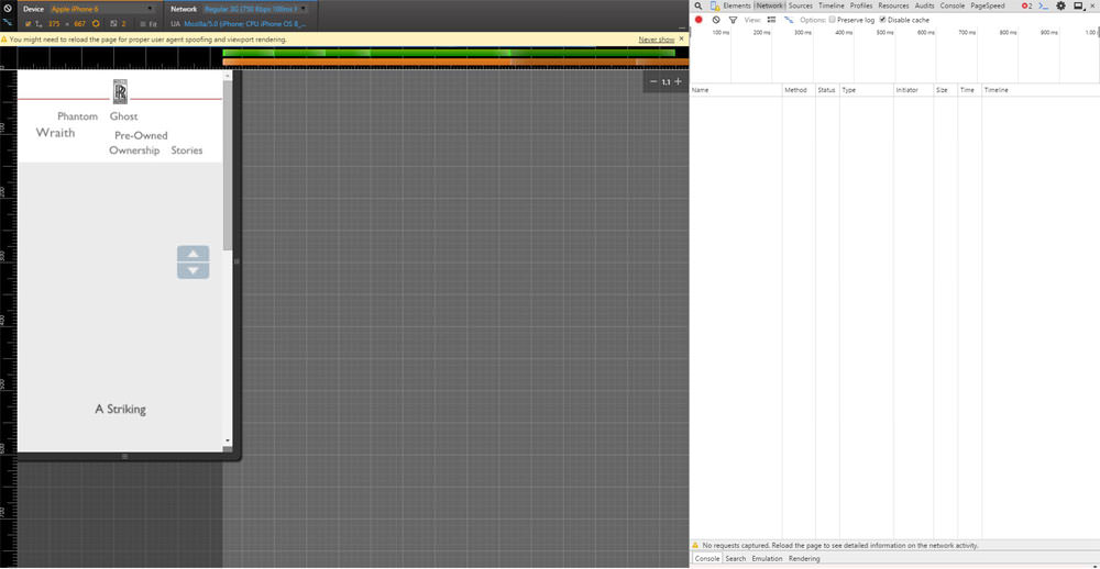
Inspect Element – Cleared Logs
Now either press F5 or click on the refresh browser page button to reload the page in this set up. You should now see the page load in the mobile phone panel on the left and see lots of lines added on the right hand panel (don’t worry too much about that now).
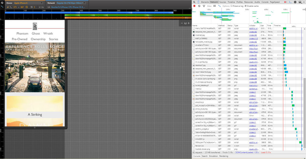
Inspect Element – Loaded Mobile Simulator
We are now waiting for the page to completely load, we will know when it is finished when there is a RED Load: ??s at the bottom (obviously the ?? would be the time it loaded the page).
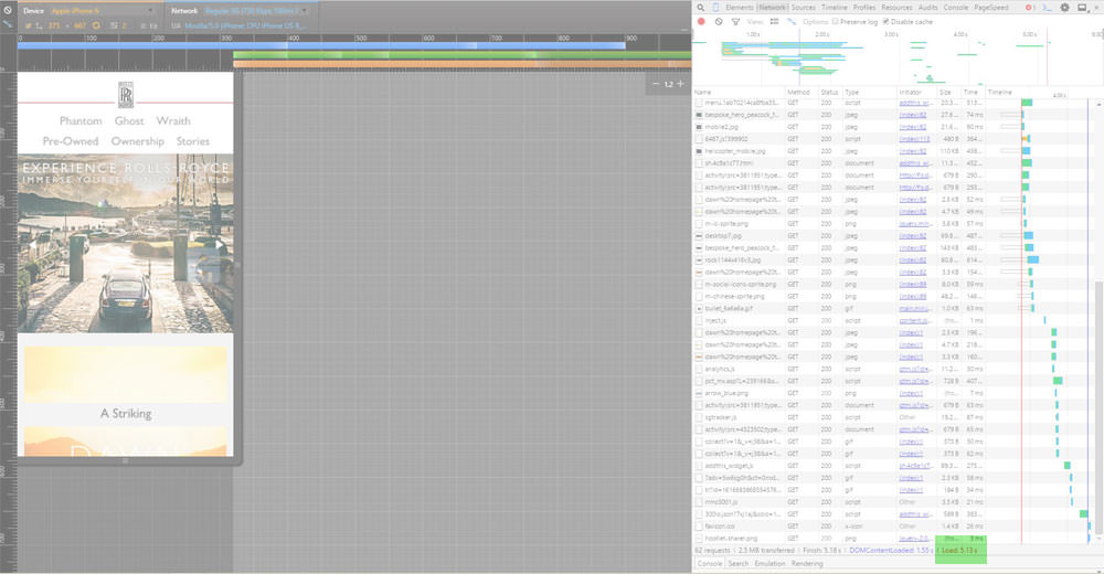
Inspect Element – Page Load Speed
So there we have it, you now know how long that page took to load using an Iphone6 on a regular speed mobile network. Of course there are loads of other things you can do with this Tool, we recommend you continue learning about this and head over to the How to identify why my page loads slowly page.
