Juicy SEO – Monthly Online Marketing Report Covering October 2016

Welcome to another edition of Juicy SEO‘s monthly online marketing report this time covering all the important updates and changes for October 2016 by the search engines.

Let’s get right to it…

 

The SEO road is rarely straight forward

Penguin

At the start of the month we saw the continuation of the roll-out off the new ‘real time’ Penguin update. It took a week or so to fully complete due to the update gradually spreading around the Worlds servers.

Now Penguin is real time several dodgy SEO’s out there are already thinking how they can manipulate this, the obvious one is to increase your link building and if you get a penalty simply remove the links and start again. Google have said that they are “ready for you!” if you are thinking about doing this and could remove the link value of all the links to your site. So, think carefully if you thinking about doing this!


Redirects

This one if really for the webmaster who is moving their site or changing their CMS. It is not good practice to 301 redirect your old pages from your previous version of your website to the homepage of your new website. Google will mark these down as soft 404 pages and which will not pass any link juice (SEO benefit). As much as a pain as it is you should create separate 301’s from your old URLs to the new replacement pages.


Mobile

On the 10th January 2017 Google will be releasing their “Intrusive Interstitial Mobile Penalty“. A what I hear you say?!

From this date if Google finds a pop-up that covers most or all of the mobile screen it will penalise the mobile version of the site. These “pop-ups” are used all over the web and include a lot of social ‘Share’ buttons and adverts. However, Google are only looking at page load and not, say, 5mins after you have been on the site or when leaving the site. Most of the good social share widgets out there will have config options that will fix this. A tool to test this is due out too soon from Google.


Mobile

In the next few months Google will start using a separate index just for mobile devices. At the moment Google uses the main desktop index for both desktop and mobile searches. By using a separate index for mobile devices they can use mobile specific ranking signals like page load speed to help them decide ranking positions.


Content

In some of our previous reports we have mentioned that it is possible to be out-ranked by another website which has a copy of your own content. This is often the case if the other site has a better domain authority than your own. That said, Google this month confirmed that it is also due to other websites taking your content and adding extra value to it, therefore, making the content even better.
This has been a very successful way of ranking Juicy SEO’s clients websites in the past, so if you are looking for some content ideas, research other content out there and make your version better!


HTTP2

As reported previously by Juicy SEO, Google this month also mentioned that they do not pass any search engine ranking ‘help’ if your website is using HTTP2.


AdWords

Google have officially rolled out ‘Click-to-Message‘ sitelinks for adverts which allow people to…. well… click and send a message. I guess the name of it explains the idea well enough.


Domain Authority

Although lots of SEO tools out there have their own “Score” of websites Google have confirmed that they do not have an overall score for a domain (I know I used domain authority above, it was purely to help explain).


Ranking

Finally, Juicy SEO have reported for several years now that it is often the case that Google search engine ranking updates occur at the end of the quarter. A member of Google’s team has also mentioned this month that this is the case. So, keep an eye on the date! 🙂


Glossary

Panda: The Google Panda update concentrates on the quality of the web page content, if the algorithm thinks the page is of low quality it might penalise it in Google’s search results.

Penguin: Google has an algorithm called Penguin which analyses links to web pages and identifies which ones are valuable or spam links. An example of a spam link would be a paid link to your site. Since 23rd Sept 2016 this has joined the core search updates and is now real time.

Pigeon: Google’s Pigeon algorithm concentrates on Local SEO, if you have a bricks and mortar business this is something you should take note of.

Phantom (Quality Update): This algorithm rewards website pages for good content.

TDL: A TLD means Top Level Domain like .com or .net or .co.uk.

AMP: Accelerated Mobile Pages. A way to increase the speed your mobile version of your website loads.

New Google Mobile Friendly Update

A little while ago back in April 2015 Google launched their mobile friendly algorithm which identified websites that were mobile friendly and reward them in the ranking results, remember Mobilegeddon?

Mobilegeddon


Well Google have announced that there will be a further update to this algorithm coming soon.

When the ‘original mobile friendly algorithm‘ was launched it decided if your website was mobile friendly and rank it a little better in mobile search results.
It was a big change and affected many websites over night. There wasn’t any gradual roll out here!

Instead over a week the algorithm helped mobile friendly websites rank better.


So back to this new update Google have informed us about. Well instead of a big impact update the new update will continuously crawl websites page by page and update their database with what they find. If your website is already mobile friendly then you have nothing to worry about.
However if you haven’t got a mobile friendly website then the chances are this update will affect you sooner or later.


When will the Google mobile friendly update happen?


Google have stated that their target is May 2016, however if you have been following our monthly SEO report you will know Google doesn’t always hit their target dates (re: Penguin update).


If you would like to check to see if your website is mobile friendly or not, Google have created a little tool which all you need to do is enter in your website address. Here is a link to it.


How to identify why my page loads slowly

Today’s post we will be identifying why website pages are slow to load on mobile devices.
We all know how important having a mobile website for today’s internet users and one of the biggest issue website owners have is trying to speed up the load time of the page.

In this post we will try and help identify areas which you can try on your own website using a completely FREE tool which is probably already on your computer. This is Google Chrome Inspect Element.

If you haven’t already we recommend that you first read our post How fast does my mobile website load? before continuing as we will continue on from the end of that post.
….go on then quickly go and read that post, we will wait for you here.

Done?!
Great, welcome back!


So we will continue to use the previous website example of Rolls Royce Motor Cars and see if we can identify areas which will help their homepage load quicker on a mobile device.

Sections of the Inspect Element Panel

In this post we will be concentrating on the Network menu option in Inspect Element and will focus on the main areas of this panel. There is so much you can get out of this tool it would make this post too long if we explained them all. We will only use the columns which will get us the important information quickly.

We will not be needing the left hand panel which shows the website in a mobile device any more so we will concentrate on the right hand panel from now on. However please make sure the left hand panel is set to Apple Iphone6 (just because it is a popular phone) and No Throttling in the Network setting.
Below we will explain what each of the important columns are and how you can use them to help find areas of your website which is slowing down your page from loading.

Column: Name

A website page is made up of many many lines of code, some of the code references other files on your or someone else’s webservers like an image or some JavaScript which manages your Navigation for example. As the page is created it goes through the code line by line to build up the page, in this column you can see each of the files names referenced in order to build the page.

Column: Status

When a page is loaded or a file is referenced there are several states that reference could make. For example if the reference was successful it would create a status code of 200. Another example would be if the reference couldn’t find the file as it is no longer at that location it would produce a 404 status code.

These codes help to provide you with useful clues to why the page it taking a long time to load. After all there isn’t any reason to go looking for some code which is know longer there!

Column: Type

This column tells you the type of file referenced, it could be a jpeg image, a script written in JavaScript or a font file. This is helpful as you can tell if the file is important to the page and experience will tell you that the file might be large and you should pay attention to it.

Column: Size

The all important Size column, as you can probably guess this tells us how big the file is in bytes, if you see a page trying to load a 10Mb image on a mobile device it should send you a pretty big signal something needs to change!

Column: Time

This column shows how long each file referenced took to load, so another very useful column.

Column: Timeline

This is the first column I tend to start with, it is a waterfall of the page loading and can identify long loading files quickly. It is shown in a bar graph type display, when you hover over the bar it provides you with further useful information.


Performing a speed test on a mobile device


Ok so lets perform a test now on Rolls Royce’s website and see if we can find anything to help them out.
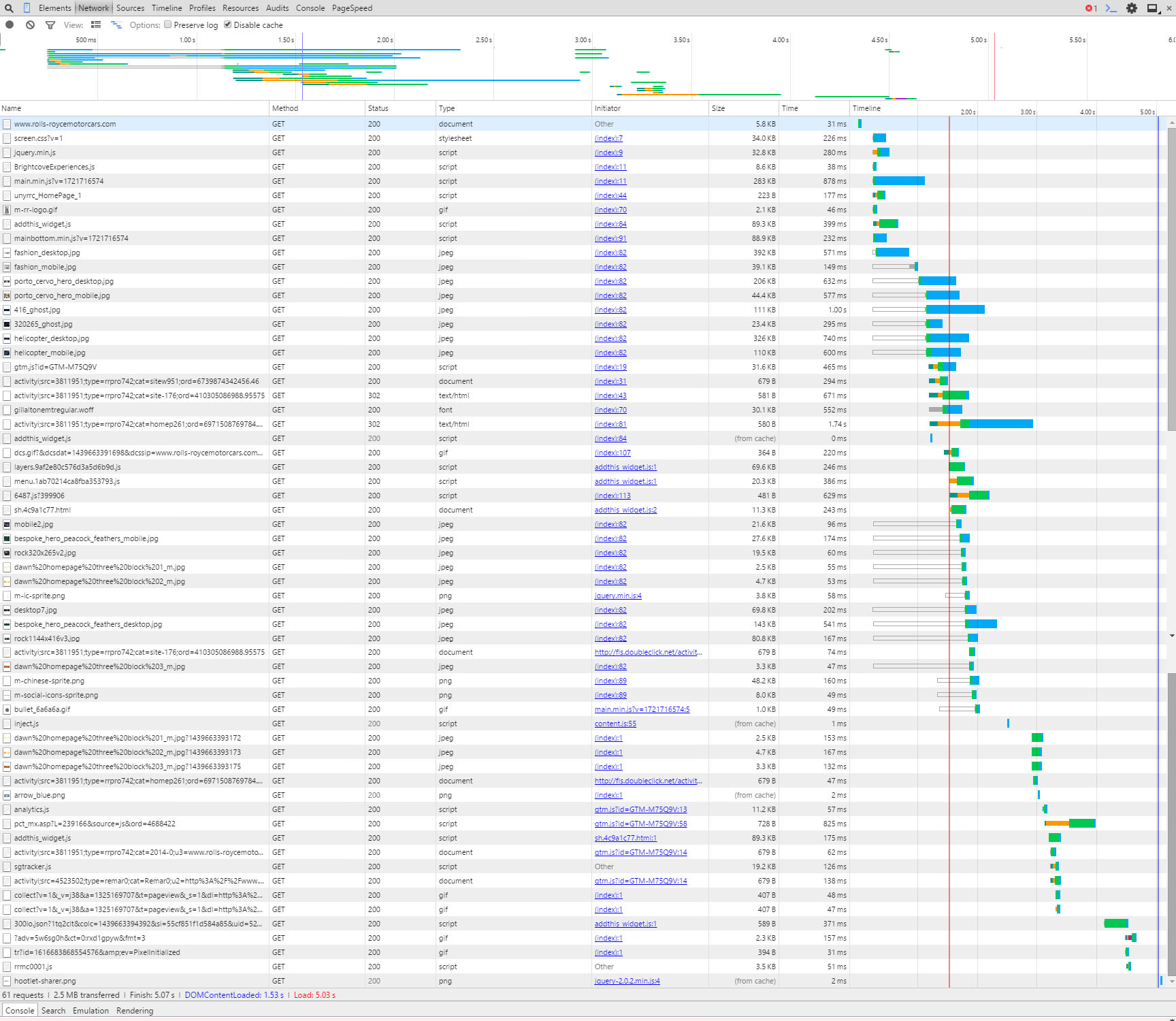
The first thing we see is that by running the refresh on the page several times it takes just under 5secs to load, ideally we would try to be nearer 3secs if possible so RR (as we are now friends with Rolls Royce I think we can call them RR) should have areas to improve.

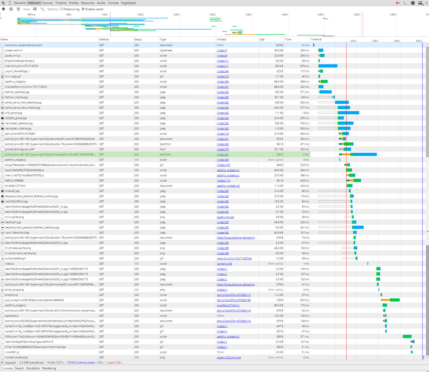
Below is a screen grab of the first initial load, you can see the bar graphs really highlighting where the time is lost.
Something to remember at this point is when a page is loading it doesn’t necessarily have to wait for the previous referenced file to load before it starts to load a new file. You can (and advised to) load multiple files at the same time. There are times you can not do this but you should try to do it as much as possible (if you want to know more about that here is a good read).


Initial load of page

Click for a larger version


This column can get quite technical which is not what this post is about, however I will mention that when you hover over the bar graph it will show a time for TTFB, this means:

Time To First Byte
Basically the time it takes to receive the first byte of data from the location (webserver). If this is high then you should speak to your hosting company to try and reduce. If they can’t help, then move to a hosting company that can!

Have a play around with the hover over the bar graph, it’s quite interesting.


Anyway back to this example, there is one line that sticks out to me, highlighted below:

Doubleclick 302 redirect

Click for a larger version


It is a link to Doubleclick.net (which is an advertising network which we assume RR are using), however it could be taking a long time to complete because it has a 302 status code in the Status column. A 302 code means that there is a redirect (temporary redirect too – another taboo but not for this post) to another page.

So to explain, if they were trying to load a file from www.rubbishwebsite.com/filelocation/ and the owners of www.rubbishwebsite.com moved the file to another location like: www.rubbishwebsite.com/new-filelocation/ they would create a redirect so you can still get to the file.
So for RR’s website to get to the data they want the request for the data from Doubleclick has to go to two locations, by changing their site so it looks at the new location it could help the speed of the page. There are other considerations to this but that is for another post, if you are performing this on your own website and see a 301 or 302 redirect we recommend updating your link.


So that is an example of using the Timeline column, the next example we will use the Name column.
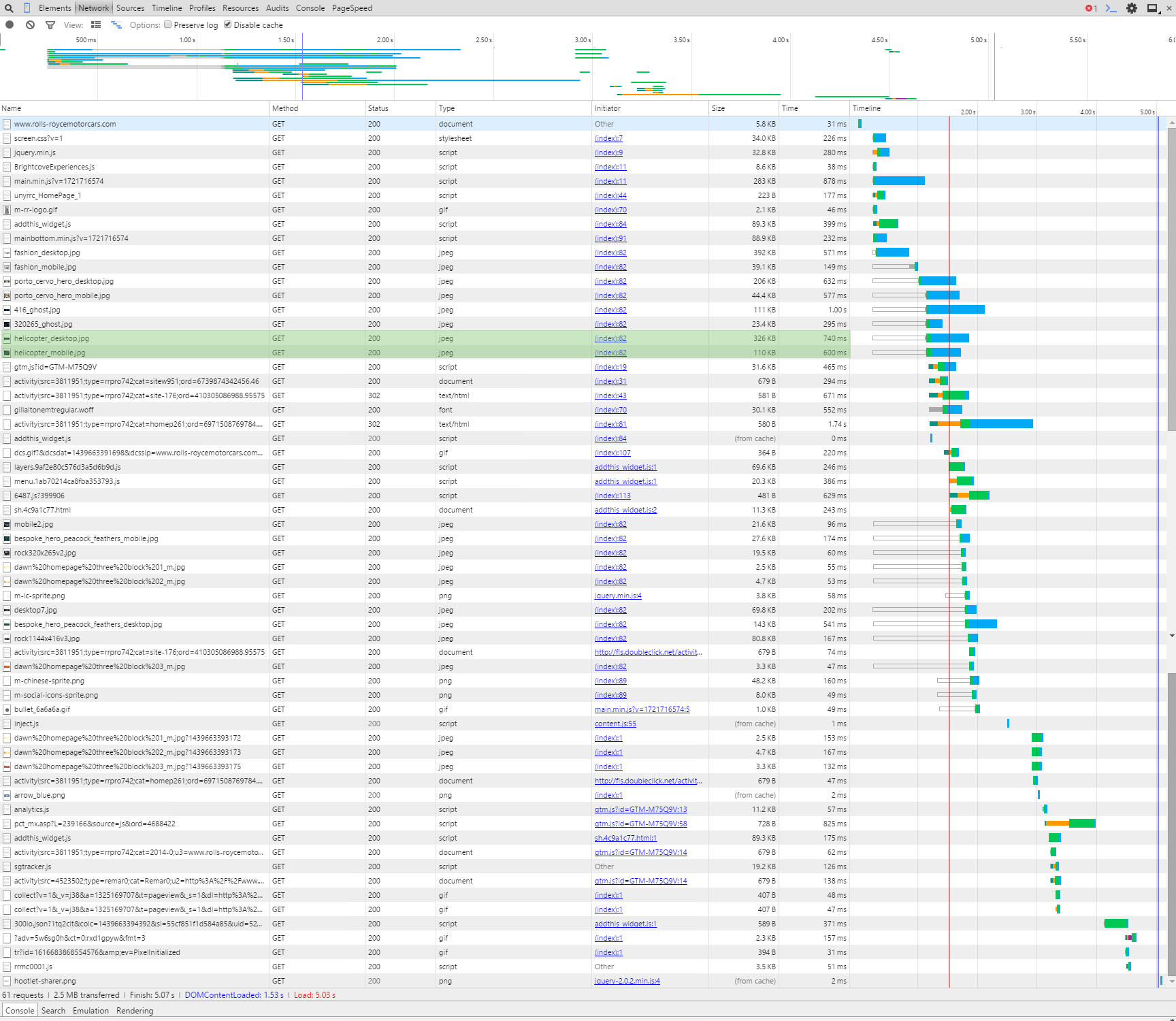
As mentioned above there are two sets of images on this website, one for desktop and the other for mobile devices. It looks like both are being loaded on mobile devices. In the screen grab below you can see the two images highlighted:

Two versions of the helicopter images

Click for a larger version


Obviously loading the correct one only would increase the speed of the page. Additionally the desktop version will be larger in size so would slow down the page load.
Whilst we are talking about images you might or might not know that there are tools that compress images so the byte size of the file is reduced. By compressing images you can save a LOT on page load times.
For example (we love our examples don’t we), the RR website uses an image called helicopter_mobile.jpg, we downloaded this file and it is 110KB, we ran the file through our image compressor and reduced it to 68.8KB, nearly half the size!! If you performed the compression to all their images alone the site would speed up considerably. Here are both the files below so you can see they look the same and there isn’t any loss in quality:


Helicopter Mobile Original
Helicopter image original
Helicopter Mobile Compressed by Juicy SEO
Helicopter image compressed
Credit of images to Rolls Royce Motor Cars, please don’t sue us for using your photos as we are only trying to help.


It’s not all doom and gloom for our best friends at RR, their server looks very quick and if they just sorted out the above it will probably be below 3secs. It just goes to show it’s not just the little businesses that need to work on their mobile websites, the big boys do too!


Now I know what needs to be changed, how do I do it?


You have now identified areas of your website which need a little attention, obviously there are many more reasons which could be slowing your webpage but I have to stop writing soon otherwise it will be tomorrow.
We will leave these to future posts where we will help tackle several of the common problems. If these future posts sound interesting to you we would love to hear from you via social media, after all feedback is the key to creating better content.
Thanks in advance!

PS: Rolls Royce a Wraith or Ghost in that nice blue would look great outside the office! 🙂

Smartphones are now more popular than desktop computers

Some interesting news came out of Google this week which if you have been reading our SEO blogs and social media posts you won’t be too shocked to hear. Google have confirmed that they are now serving more searches on smartphones than on desktop computers. I guess this also coincides with the reduction in desktop computer sales over the last few years too.
Although they only say the stats are for 10 countries however they do include USA and Japan, as the UK often follows the US a few months later expect (if it isn’t already) this to be the same here.

What is also interesting is that when Google record these stats they bundle up users of Tablet users with those of Desktop users, therefore this means at least half of all searches (in the tested countries) are now using a smartphone.
This is an huge increase even from the stats of 2014 which could be as much a double the amount of smartphone users.

Google Mobile Friendly Search


Google are and will continue (we suspect) to change their user interface of their products to be aimed at smartphone users. They are currently rolling out smartphone optimised advert formats via their Adwords network, this will increase the number of smartphone clicks on adverts.

This news is very important for website owners, with the recent Google Mobile algorithm update it is very important to have a mobile friendly website as Google will be “recommending” mobile friendly websites more.

If you would like to read the statement from Google about their Adwords change for mobile users here is the link.


Mobilegeddon is here! Save the World!

Mobliegeddon, it’s a great word isn’t it?
It sounds like the world is going to end for mobiles or something, very dramatic!

However this is not going to happen so you can relax in the knowledge you will still be able to play Candy Crush on your tablet.
In fact ‘Mobilegeddon’ has been used to name the launch of a new algorithm from Google which ranks websites which are designed for mobile devices better than websites which are not. This will only affect searches using Google’s mobile search facility (ie: using Google from a mobile device).
The new algorithm was launched on 21st April 2015 and Google have said it will take a week to completely roll it out.

This isn’t something they have sprung on us, they gave us a ‘heads up’ on this a couple of months ago.

If you would like to know more about this algorithm update from Google read our blog post on Googles Mobile Algorithm or What is a Mobile Website?

I’m writing this post on the 26th April so 5 days into the roll out. Juicy SEO test new algorithm updates all year round and this one is no exception. To test this new update we have deliberately left sites out there which are absolutely shocking to use on a mobile device purely to watch the results of this change. We are also monitoring many other websites which are not mobile friendly to gather as much information as possible.

Mobilegeddon

So far after monitoring 1000s of keywords every day for many websites we have yet to see any real ranking differences between the standard search results and the mobile results. There have only been a few keywords with a very minimal difference (1 position difference for 4 keywords) which we do not think is related to this update.

This isn’t to say all these ranking positions won’t all change tomorrow as there are still few days left to go. Additionally we are monitoring UK based websites and the change just might not have filtered over the pond just yet. Google are rolling out the update Data-centre by Data-centre and it will take a week to do.
Additionally from what we have read from other SEOs based in the states it doesn’t sound like much has happened over there either.


Is there really an update coming?

Now the sceptic in me is thinking that if I ran a search engine and wanted to produce good search results for mobile devices, saying to all webmasters if you don’t make your website mobile friendly it will not rank well is a pretty good way to do it. After all users of Google whilst on mobile devices want search results which work well on their device, if the user is happy they will keep using Google.

In a recent survey it was reported that it is now a near 50/50 split of people using the internet on a mobile device compared with a desktop computer. This is clearly going to sway towards the mobile device very soon and Google know this, so providing a good search results for mobile devices will be very important for them. Other search engines are slowly catching Google up in terms of monthly users so they can’t sit on their laurels.

So all this end of the world style Mobilegeddon might just be a way to help Google get what they want?

This wouldn’t be the first time Google have done something like this, it wasn’t that long ago Google said that if you move your website to a secure server (SSL cert, using HTTPS) the website will receive a boost in their search results, even if only a little. From our test results it was a VERY little boost indeed!
However it did push some reluctant webmasters to secure their website, and we all want a secure internet so it wasn’t a bad result really was it?

Even if nothing comes of this it is still a win for website owners who have made their website mobile friendly as your visitors will appreciate it!

As said above we still have a few days to go and the ‘Mobile Friendly’ tag is being seen in mobile search results so who knows!

If you agree, disagree we would love to hear from you on our Facebook page or on Twitter.

How many websites will Google’s Mobile Algorithm affect?

In case you have not heard but Google will be launching their Mobile Friendly Algorithm update on the 21st April. This is a big deal if you own or run a website. If you don’t then I suspect you don’t really care, if that’s you then get your skis out and hit the slopes, here is a cool Ski holiday website.

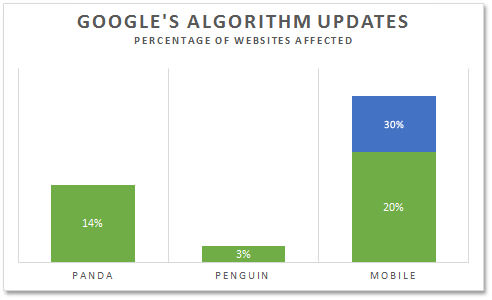
If however you are interested how much the up and coming Mobile algorithm update from Google will affect websites here are the stats!

Googles Mobile Algorithm Update


If you combine the two previous biggest algorithms launched by Google it would not add up to the conservative estimate figure of how many websites will be affected. So this is a BIG deal!

Google’s Panda Algorithm update affected 14% of all websites

Google’s Penguin Algorithm update affected 3% of all websites (which is a lot by the way!)

Google’s Mobile Algorithm update is estimated to affect between 20 – 30% of all websites!! (yes double exclamation marks needed there!)

Don’t hang around and get your website mobile friendly. If you are not sure if your website is mobile friendly or not heard over to our ‘What is a Mobile Website‘ page and you can test yours!

What is a Mobile Website?

Recently there has been a lot of talk about mobile websites, Google have announced that they are making a change to their algorithm for mobile search results that will affect all non-mobile websites.

But what is considered a mobile website and what do I need to do so my website is not affected by this algorithm?


There are essentially 4 types of websites relating to mobile devices:

  1. The old style website which doesn’t care about mobile devices, it doesn’t fit on ‎smaller screens and you have to pinch and zoom out to see the pages. The text is very small and the buttons are just a small.
  2. Next are sites that have had some coding put in place so the website fits on your mobile phone or tablet. You still need to pinch for somethings and the buttons are often too small for fat fingers. They look like the desktop version but on a smaller screen. This is often seen as a suitable fix for a mobile responsive website.


Juicy SEO Social Media Management


  1. The next one is a mobile designed website, when your website is viewed on a phone the buttons are thumb sized, the menu options are easy to navigate on a small screen (often using the hamburger icon) and images are smaller so it is quicker to load the page. Remember Google likes fast loading pages and it is now thought to be part of their main search algorithm.
  2. Finally the website that has be tailored for their mobile visitors. Identifying the details they are looking for and having these details near the top of the page. If having your website shared on social media is important then make sure you have the ‘share this page’ buttons easy to get to. If you are a shop or restaurant for example, somewhere people can actually visit then your location, address, click-able phone number, map and maybe Sat Nav functions might be important. Real thought on what mobile users need from your website.


Ok so now you know what needs to be done, who should you call? One word….

Ghostbusters!

…sorry couldn’t resist.

The obvious person is your website developer (or company), anyone who makes websites worth their salt will know what to do. Ask them for examples of their work to make sure and test on your own mobile device (or several if you have). If they haven’t got one to show then it’s time to find someone new as they are very behind the times!

…the biggest search engine ranking shake-up for several years…

The next question you might ask yourself is…

Is my current website already mobile friendly?

There are many tools and simulators out there which test websites for this however there is really only one you need to satisfy, and that is Google’s!

This is a link to their test, enter in your website to find out.

Google Mobile Website Test Page

If this tools says your site is not mobile ready then you need to makes some changes.


On 21st April 2015 Google will be rolling out an algorithm update which will take about a week to complete, it will affect websites that are not designed for mobile devices.

It is looking like it could be the biggest search engine ranking shake-up for several years, so expect your traffic figures to change either up or down. Of course if your website is already ready for this update your competitors might not be, you could do one of two things here:

  1. Let your competitors know they are just about to lose a lot visitors to their website and they should make their website mobile ready.
  2. Or you could just let them figure it out for themselves and you can have all their customers. It would teach them for not following Juicy SEO would it!


The algorithm update will N‎OT affect your website in normal desktop search results, however it is now nearly 50/50 users of the internet use mobile devices to surf, wouldn’t you be silly to ignore?!
‎

Want to know what else is happening in the world of SEO? Head over to our latest Monthly Search Engine Optimisation 2min update!